Category Archives: CH 3.0

We choose Bao Bao!

So, the Pen went live on March 10. We’re handing them out to every visitor and people are collecting objects all over the place. Yay!

The Pen not only represents a whole world of brand-new for the museum but an equally enormous world of change for staff and the ways they do their jobs. One of the places this has manifested itself is the sort of awkward reality of being able to collect an object in the galleries only to discover that the image for that object or, sometimes, the object itself still hasn’t been marked as public in the collections database.

It’s unfortunate but we’ll sort it all out over time. The more important question right now is how we handle objects that people have collected in the galleries (that are demonstrably public) but whose ground truth hasn’t bubbled back up to our own canonical source of truth.

In the early days when we were building and testing the API methods for recording the objects that people collected the site would return a freak-out-and-die error the moment it encountered something that a visitor didn’t have permissions to see. This is a pretty normal approach in software and systems development but it made testing over the overall system complicated and time-consuming.

In the interest of expediency we replaced the code that threw a temper tantrum with code that effectively said la la la la la… I can’t hear you! If a visitor tried to collect something that they didn’t have permissions to see we would simply drop it on the floor and pretend it never happened. This was useful in fleshing out the rest of the overall workflow of the system but we also understood that it was temporary at best.

Screen Shot 2015-03-20 at 12.07.07 PM

Allowing a user to collect something in the gallery and then denying any evidence of the event on their visit webpage would be… not good. So now we record the item being collected but we also record a status flag next to that event assuming that the disconnect between reality and the database will work itself out in favour of the visitor.

It also means that the act of collecting an object still has a permalink; something that a visitor can share or just hold on to for future reference even if the record itself is incomplete. And that record exists in the context of the visit itself. If you can see the other objects that you collected around the same time as a not-quite-public-yet object then they can act as a device to remember what that mystery thing is.

Which raises an important question: What should we use as a placeholder? Until a couple of days ago this is what we showed visitors.

streetview-cat-words

Although the “Google Street View Cat” has a rich pedigree of internet meme-iness it remains something of an acquired taste. This was a case of early debugging and blowing-off-steam code leaking in to production. It was also the result of a bug ticket that I filed for Sam on January 21 being far enough down to the list of things to do before and immediately after the launch of the Pen that it didn’t get resolved until this week. The ticket was simply titled “Animated pandas”.

As in, this:

This is the same thread that we’ve been pulling on ever since we started rebuilding the collections website: When we are unable to show something to a visitor (for whatever reason) what do we replace the silence with?

We choose Bao Bao!

Labs turns three!

Candles atop a blackberry and giner donut

Happy birthday Cooper Hewitt Labs.

Today Cooper Hewitt Labs turned three.

Back in January 2012 this blog was just an experiment, a flag planted in rough terrain, but now what is actually the ‘Digital & Emerging Media’ team, is better known out there in the world as Cooper Hewitt Labs. In fact there’s a recent #longread in The Atlantic that focuses specifically on the Labs’ work.

It is funny how naming something brings it into the world, but its true. It is also true that what the Labs is is fragile. It is a group of people who happen to work well with each other, and the people around them, to make something much greater than what could be achieved individually.

For the first year the mascot of the Labs was the mischievous Japanese spirit (or yokai) called the Tanuki, and the second was the equally naughty “Cat (and Kitten) in the act of spanking“, the new mascot that watches over the Labs is the memetic and regal, Design Eagle.

Happy birthday to us.

If you’d like the last three years of blog posts wrapped up in easy to carry PDF format (or because ‘blogs don’t last forever’), here they are – 2012 (37mb) | 2013 (34mb) | 2014 (25mb).

How re-opening the museum enhanced our online collection: new views, new API methods

At the backend of our museum’s new interactive experiences lies our API, which is responsible for providing the frontend with all the data necessary to flesh out the experience. From everyday information like an object’s title to more novel features such as tags, videos and people relationships, the API gathers and organizes everything that you see on our digital tables before it gets displayed.

In order to meet the needs of the experiences designed for us by Local Projects on our interactive tables, we added a lot of new data to the API. Some of it was sitting there and we just had to go find it, other aspects we had to generate anew.

Either way, this marks a huge step towards a more complete and meaningful representation of our collection on the internet.

Today, we’re happy to announce that all of this newly-gathered data is live on our website and is also publicly available over the API (head to the API methods documentation to see more about that if you’re interested in playing with it programmatically).

People

For the Hewitt Sisters Collect exhibition, Local Projects designed a front-end experience for the multitouch tables that highlights the early donors to the museum’s collection and how they were connected to each other. Our in-house “TMS liaison”, Sara Rubinow, worked to gather and structure this information before adding it to TMS, our collection management system, as “constituent associations”. From there I extracted the structured data to add to our website.

We created a the following new views on the web frontend to house this data:

We also added a few new biography-related fields: portraits or photographs of Hewitt Sisters people and two new biographies, one 75 words and the other 50 characters. These changes are viewable on applicable people pages (e.g. Eleanor Garnier Hewitt) and the search results page.

The overall effect of this is to make more use of this ‘people-related’ data, and to encourage the further expansion of it over time. We can already imagine a future where other interfaces examining and revealing the network of relationships behind the people in our collection are easily explored.

Object Locations and Things On Display

Some of the more difficult tasks in updating our backend to meet the new requirements related to dealing with objects no longer being static – but moving on and off display. As far as the website was concerned, it was a luxury in our three years of renovation that objects weren’t moving around a whole lot because it meant we didn’t have to prioritize the writing of code to handle their movement.

But now that we are open we need to better distinguish those objects in storage from those that are on display. More importantly, if it is on display, we also need to say which exhibition, and which room it is on display.

Object locations have a lot of moving parts in TMS, and I won’t get into the specifics here. In brief, object movements from location to location are stored chronologically in a database. The “movement” is its own row that references where it moved and why it moved there. By appropriately querying this history we can say what objects have ever been in the galleries (like all museums there are a large portion of objects that have never been part of an exhibition) and what objects are there right now.

We created the following views to house this information:

Exhibitions

The additions we’ve made to exhibitions are:

There is still some work to be done with exhibitions. This includes figuring out a way to handle object rotations (the process of swapping out some objects mid-exhibition) and outgoing loans (the process of lending objects to other institutions for their exhibitions). We’re expecting that objects on loan should say where they are, and in which external exhibition they are part of — creating a valuable public ‘trail’ of where an object has traveled over its life.

Tags

Over the summer, we began an ongoing effort to ‘tag’ all the objects that would appear on the multitouch tables. This includes everything on display, plus about 3,000 objects related to those. The express purpose for tags was to provide a simple, curated browsing experience on the interactive tables – loosely based around themes ‘user’ and ‘motif’. Importantly these are not unstructured, and Sara Rubinow did a great job normalizing them where possible, but there haven’t been enough exhibitions, yet, to release a public thesaurus of tags.

We also added tags to the physical object labels to help visitors draw their own connections between our objects as they scan the exhibitions.

On the website, we’ve added tags in a few places:

That’s it for now – happy exploring! I’ll follow up with more new features once we’re able to make the associated data public.

Until then, our complete list of API methods is available here.

Sharing our videos, forever

This is one in a series of Labs blogposts exploring the inhouse built technologies and tools that enable everything you see in our galleries.

Our galleries and Pen experience are driven by the idea that everything a visitor can see or do in the museum itself should be accessible later on.

Part of getting the collections site and API (which drives all the interfaces in the galleries designed by Local Projects) ready for reopening has involved the gathering and, in some cases, generation of data to display with our exhibits and on our new interactive tables. In the coming weeks, I’ll be playing blogger catch-up and will write about these new features. Today, I’ll start with videos.

jazz hands

Besides the dozens videos produced in-house by Katie – such as the amazing Design Dictionary series – we have other videos relating to people, objects and exhibitions in the museum. Currently, these are all streamed on our YouTube channel. While this made hosting much easier, it meant that videos were not easily related to the rest of our collection and therefore much harder to find. In the past, there were also many videos that we simply didn’t have the rights to show after their related exhibition had ended, and all the research and work that went into producing the video was lost to anyone who missed it in the gallery. A large part of this effort was ensuring that we have the rights to keep these videos public, and so we are immensely grateful to Matthew Kennedy, who handles all our image rights, for doing that hard work.

A few months ago, we began the process of adding videos and their metadata in to our collections website and API. As a result, when you take a look at our page for Tokujin Yoshioka’s Honey-Pop chair , below the object metadata, you can see its related video in which our curators and conservators discuss its unique qualities. Similarly, when you visit our page for our former director, the late Bill Moggridge, you can see two videos featuring him, which in turn link to their own exhibitions and objects. Or, if you’d prefer, you can just see all of our videos here.

In addition to its inclusion in the website, video data is also now available over our API. When calling an API method for an object, person or exhibition from our collection, paths to the various video sizes, formats and subtitle files are returned. Here’s an example response for one of Bill’s two videos:

{
  "id": "68764297",
  "youtube_url": "www.youtube.com/watch?v=DAHHSS_WgfI",
  "title": "Bill Moggridge on Interaction Design",
  "description": "Bill Moggridge, industrial designer and co-founder of IDEO, talks about the advent of interaction design.",
  "formats": {
    "mp4": {
      "1080": "https://s3.amazonaws.com/videos.collection.cooperhewitt.org/DIGVID0059_1080.mp4",
      "1080_subtitled": "https://s3.amazonaws.com/videos.collection.cooperhewitt.org/DIGVID0059_1080_s.mp4",
      "720": "https://s3.amazonaws.com/videos.collection.cooperhewitt.org/DIGVID0059_720.mp4",
      "720_subtitled": "https://s3.amazonaws.com/videos.collection.cooperhewitt.org/DIGVID0059_720_s.mp4"
    }
  },
  "srt": "https://s3.amazonaws.com/videos.collection.cooperhewitt.org/DIGVID0059.srt"
}

The first step in accomplishing this was to process the videos into all the formats we would need. To facilitate this task, I built VidSmanger, which processes source videos of multiple sizes and formats into consistent, predictable derivative versions. At its core, VidSmanger is a wrapper around ffmpeg, an open-source multimedia encoding program. As its input, VidSmanger takes a folder of source videos and, optionally, a folder of SRT subtitle files. It outputs various sizes (currently 1280×720 and 1920×1080), various formats (currently only mp4, though any ffmpeg-supported codec will work), and will bake-in subtitles for in-gallery display. It gives all of these derivative versions predictable names that we will use when constructing the API response.

a flowchart showing two icons passing through an arrow that says "vidsmang" and resulting in four icons

Because VidSmanger is a shell script composed mostly of simple command line commands, it is easily augmented. We hope to add animated gif generation for our thumbnail images and automatic S3 uploading into the process soon. Here’s a proof-of-concept gif generated over the command line using these instructions. We could easily add the appropriate commands into VidSmanger so these get made for every video.

anim

For now, VidSmanger is open-source and available on our GitHub page! To use it, first clone the repo and the run:

./bin/init.sh

This will initialize the folder structure and install any dependencies (homebrew and ffmpeg). Then add all your videos to the source-to-encode folder and run:

./bin/encode.sh

Now you’re smanging!

The API at the center of the museum

Extract from "Outline map of New York Harbor & vicinity : showing main tidal flow, sewer outlets, shellfish beds & analysis points.",  New York Bay Pollution Commission, 1905. From New York Public Library.

Extract from “Outline map of New York Harbor & vicinity : showing main tidal flow, sewer outlets, shellfish beds & analysis points.”, New York Bay Pollution Commission, 1905. From New York Public Library.

Beneath our cities lies vast, labyrinthine sewer systems. These have been key infrastructures allowing our cities to grow larger, grow more densely, and stay healthy. Yet, save for passing interests in Urban Exploration (UrbEx), we barely think of them as ‘beautifully designed systems’. In their time, the original sewer systems were critical long term projects that greatly bettered cities and the societies they supported.

In some ways what the Labs has been working on over the past few years has been a similar infrastructure and engineering project which will hopefully be transformative and enabling for our institution as a whole. As SFMOMA’s recent post, which included an interview with Labs’ Head of Engineering, Aaron Cope, makes clear, our API and the collection site that it is built upon, is a carrier for a new type of institutional philosophy.

Underneath all our new shiny digital experiences – the Pen, the Immersion Room, and other digital experiences – as well as the refreshed ‘services layer’ of ticketing, Pen checkouts, and object label management, lies our API. There’s no readymade headline or Webby award awaiting a beautifully designed API – and probably there shouldn’t be. These things should just work and provide the benefit to their hosts that they promised.

So why would a museum burden itself with making an API to underpin all its interactive experiences – not just online but in-gallery too?

Its about sustainability. Sustainability of content, sustainability of the experiences themselves, and also, importantly, a sustainability of ‘process’. A new process whereby ideas can be tested and prototyped as ‘actual things’ written in code. In short, as Larry Wall said its about making “easy things easy and hard things possible”.

The overhead it creates in the short term is more than made up for in future savings. Where it might be prudent to take short cuts and create a separate database here, a black box content library there, the fallout would be unchanging future experiences unable to be expanded upon, or, critically, rebuilt and redesigned by internal staff.

Back at my former museum, then Powerhouse web manager Luke Dearnley, wrote an important paper on the reasons to make your API central to your museum back in 2011. There the API was used internally to do everything relating to the collection online but it only had minor impact on the exhibition floor. Now at Cooper Hewitt the API and exhibition galleries are tightly intertwined. As a result there’s a definite ‘API tax’ that is being imposed on our exhibition media partners – Local Projects and Tellart especially – but we believe it is worth it.

So here’s a very high level view of ‘the stack’ drawn by Labs’ Media Technologist, Katie.

Click to enlarge

Click to enlarge

At the bottom of the pyramid are the two ‘sources of truth’. Firstly, the collection management system into which is fed curatorial knowledge, provenance research, object labels and interpretation, public locations of objects in the galleries, and all the digitised media associated with objects, donors and people associated with the collection. There’s also now the other fundamental element – visitor data. Stored securely, Tessitura operates as a ticketing system for the museum and in the case of the API operates as an identity-provider where needed to allow for personalisation.

The next layer up is the API which operates as a transport between the web and both the collection and Tessitura. It also enables a set of other functions – data cleanup and programmatic enhancement.

Most regular readers have already seen the API – apart from TMS, the Collection Management System, it is the oldest piece of the pyramid. It went live shortly after the first iteration of the new collections website in 2012. But since then it has been growing with new methods added regularly. It now contains not only methods for collection access but also user authentication and account structures, and anonymised event logs. The latter of these opens up all manner of data visualization opportunities for artists and researchers down the track.

In the web layer there is the public website but also for internal museum users there are small web applications. These are built upon the API to assist with object label generation, metadata enhancement, and reporting, and there’s even an aptly-named ‘holodeck’ for simulating all manner of Pen behaviours in the galleries.

Above this are the two public-facing gallery layers. The application and interfaces designed and built on top of the API by Local Projects, the Pen’s ecosystem of hardware registration devices designed by Tellart, and then the Pen itself which operates as a simple user interface in its own right.

What is exciting is that all the API functionality that has been exposed to Local Projects and Tellart to build our visitor experience can also progressively be opened up to others to build upon.

Late last year students in the Interaction Design class at NYU’s ITP program spent their semester building a range of weird and wonderful applications, games and websites on top of the basic API. That same class (and the interested public in general) will have access to far more powerful functionality and features once Cooper Hewitt opens in December.

The API is here for you to use.

Label Whisperer

Screen Shot 2014-01-24 at 6.06.47 PM

Have you ever noticed the way people in museums always take pictures of object labels? On many levels it is the very definition of an exercise in futility. Despite all the good intentions I’m not sure how many people ever look at those photos again. They’re often blurry or shot on an angle and even when you can make out the information there aren’t a lot of avenues for that data to get back in to the museum when you’re not physically in the building. If anything I bet that data gets slowly and painfully typed in to a search engine and then… who knows what happens.

As of this writing the Cooper-Hewitt’s luxury and burden is that we are closed for renovations. We don’t even have labels for people to take pictures of, right now. As we think through what a museum label should do it’s worth remembering that cameras and in particular cameras on phones and the software for doing optical character recognition (OCR) have reached a kind of maturity where they are both fast and cheap and simple. They have, in effect, showed up at the party so it seems a bit rude not to introduce ourselves.

I mentioned that we’re still working on the design of our new labels. This means I’m not going to show them to you. It also means that it would be difficult to show you any of the work that follows in this blog post without tangible examples. So, the first thing we did was to add a could-play-a-wall-label-on-TV endpoint to each object on the collection website. Which is just fancy-talk for “another web page”.

Simply append /label to any object page and we’ll display a rough-and-ready version of what a label might look like and the kind of information it might contain. For example:

https://collection.cooperhewitt.org/objects/18680219/label/

Now that every object on the collection website has a virtual label we can write a simple print stylesheet that allows us to produce a physical prototype which mimics the look and feel and size (once I figure out what’s wrong with my CSS) of a finished label in the real world.

photo 2

So far, so good. We have a system in place where we can work quickly to change the design of a “label” and test those changes on a large corpus of sample data (the collection) and a way to generate an analog representation since that’s what a wall label is.

Careful readers will note that some of these sample labels contain colour information for the object. These are just placeholders for now. As much as I would like to launch with this information it probably won’t make the cut for the re-opening.

Do you remember when I mentioned OCR software at the beginning of this blog post? OCR software has been around for years and its quality and cost and ease-of-use have run the gamut. One of those OCR application is Tesseract which began life in the labs at Hewlitt-Packard and has since found a home and an open source license at Google.

Tesseract is mostly a big bag of functions and libraries but it comes with a command-line application that you can use to pass it an image whose text you want to extract.

In our example below we also pass an argument called label. That’s the name of the file that Tesseract will write its output to. It will also add a .txt extension to the output file because… computers? These little details are worth suffering because when fed the image above this is what Tesseract produces:

$> tesseract label-napkin.jpg label
Tesseract Open Source OCR Engine v3.02.01 with Leptonica
$> cat label.txt
______________j________
Design for Textile: Napkins for La Fonda del
Sol Restaurant

Drawing, United States ca. 1959

________________________________________
Office of Herman Miller Furniture Company

Designed by Alexander Hayden Girard

Brush and watercolor on blueprint grid on white wove paper

______________._.._...___.___._______________________
chocolate, chocolate, sandy brown, tan

____________________..___.___________________________
Gift of Alexander H. Girard, 1969-165-327

I think this is exciting. I think this is exciting because Tesseract does a better than good enough job of parsing and extracting text that I can use that output to look for accession numbers. All the other elements in a wall label are sufficiently ambiguous or unstructured (not to mention potentially garbled by Tesseract’s robot eyes) that it’s not worth our time to try and derive any meaning from.

Conveniently, accession numbers are so unlike any other element on a wall label as to be almost instantly recognizable. If we can piggy-back on Tesseract to do the hard work of converting pixels in to words then it’s pretty easy to write custom code to look at that text and extract things that look like accession numbers. And the thing about an accession number is that it’s the identifier for the thing a person is looking at in the museum.

To test all of these ideas we built the simplest, dumbest HTTP pony server to receive photo uploads and return any text that Tesseract can extract. We’ll talk a little more about the server below but basically it has two endpoints: One for receiving photo uploads and another with a simple form that takes advantage of the fact that on lots of new phones the file upload form element on a website will trigger the phone’s camera.

This functionality is still early days but is also a pretty big deal. It means that the barrier to developing an idea or testing a theory and the barrier to participation is nothing more than the web browser on a phone. There are lots of reasons why a native application might be better suited or more interesting to a task but the time and effort required to write bespoke applications introduces so much hoop-jumping as to effectively make simple things impossible.

photo 2
photo 3

Given a simple upload form which triggers the camera and a submit button which sends the photo to a server we get back pretty much the same thing we saw when we ran Tesseract from the command line:

Untitled-cropped

We upload a photo and the server returns the raw text that Tesseract extracts. In addition we do a little bit of work to examine the text for things that look like accession numbers. Everything is returned as a blob of data (JSON) which is left up to the webpage itself to display. When you get down to brass tacks this is really all that’s happening:

$> curl -X POST -F "file=@label-napkin.jpg" https://localhost | python -mjson.tool
{
    "possible": [
        "1969-165-327"
    ],
    "raw": "______________j________nDesign for Textile: Napkins for La Fonda delnSol RestaurantnnDrawing, United States ca. 1959nn________________________________________nOffice of Herman Miller Furniture CompanynnDesigned by Alexander Hayden GirardnnBrush and watercolor on blueprint grid on white wove papernn______________._.._...___.___._______________________nchocolate, chocolate, sandy brown, tannn____________________..___.___________________________nGift of Alexander H. Girard, 1969-165-327"
}

Do you notice the way, in the screenshot above, that in addition to displaying the accession number we are also showing the object’s title? That information is not being extracted by the “label-whisperer” service. Given the amount of noise produced by Tesseract it doesn’t seem worth the effort. Instead we are passing each accession number to the collections website’s OEmbed endpoint and using the response to display the object title.

Here’s a screenshot of the process in a plain old browser window with all the relevant bits, including the background calls across the network where the robots are talking to one another, highlighted.

label-whisperer-napkin-boxes

  1. Upload a photo
  2. Extract the text in the photo and look for accession numbers
  3. Display the accession number with a link to the object on the CH collection website
  4. Use the extracted accession number to call the CH OEmbed endpoint for additional information about the object
  5. Grab the object title from the (OEmbed) response and update the page

See the way the OEmbed response contains a link to an image for the object? See the way we’re not doing anything with that information? Yeah, that…

But we proved that it can be done and, start to finish, we proved it inside of a day.

It is brutally ugly and there are still many failure states but we can demonstrate that it’s possible to transit from an analog wall label to its digital representation on a person’s phone. Whether they simply bookmark that object or email it to a friend or fall in to the rabbit hole of life-long scholarly learning is left an as exercise to the reader. That is not for us to decide. Rather we have tangible evidence that there are ways for a museum to adapt to a world in which all of our visitors have super-powers — aka their “phones” — and to apply those lessons to the way we design the museum itself.

We have released all the code and documentation required build your own “label whisperer” under a BSD license but please understand that it is only a reference implementation, at best. A variation of the little Flask server we built might eventually be deployed to production but it is unlikely to ever be a public-facing thing as it is currently written.

https://github.com/cooperhewitt/label-whisperer/

We welcome any suggestions for improvements or fixes that you might have. One important thing to note is that while accession numbers are pretty straightforward there are variations and the code as it written today does not account for them. If nothing else we hope that by releasing the source code we can use it as a place to capture and preserve a catalog of patterns because life is too short to spend very much of it training robot eyes to recognize accession numbers.

The whole thing can be built without any external dependencies if you’re using Ubuntu 13.10 and if you’re not concerned with performance can be run off a single “micro” Amazon EC2 instance. The source code contains a handy setup script for installing all the required packages.

Immediate next steps for the project are to make the label-whisperer server hold hands with Micah’s Object Phone since being able to upload a photo as a text message would make all of this accessible to people with older phones and, old phone or new, requires users to press fewer buttons. Ongoing next steps are best described as “learning from and doing everything” talked about in the links below:

Discuss!

Rijkscolors! (or colorific promiscuity)


rijkscolours-yellow

(Rijkscolors are currently disabled as we consider longer-term solutions for cross-institutional browsing and searching. It’ll be back soon!)

Rijkscolors are an experimental feature that allow you to browse not only images from the Cooper-Hewitt’s collection but also images from the Rijksmuseum by color!

We see this as one way to start to work through the age-old problem of browsing collections across multiple institutions. Not everyone arrives at the Cooper-Hewitt (or the Rijksmuseum) with an expert knowledge of our curatorial and collecting history and the sheer volume of “stuff” available can be overwhelming. Everyone, at some point, has the “Explore” problem: It’s the point where you have so much good stuff to share with people but no good (or many sort-of-bad) avenues for letting people know about it.

Color is an intuitive, comfortable and friendly way to let people warm up to the breadth and depth of our collections. Since adding the ability to search the collection by color it’s quickly become the primary way that people browse our collection (more on that below) and as such feels like an excellent tool for browsing across collections.

rijkscolours-4

Over time, we hope to add this functionality for many other cultural heritage institutions but chose to start with the Rijksmuseum because we share an historical focus in our early collecting practices and because they were nice (read: AWESOME) enough to make all their collection images available under a liberal Creative Commons license.

We then indexed all those images using the same tools we use to extract colors and measure busy-ness or “entropy” from our own collection and combined the two lists. Images from the Rijksmuseum have a different colored border to indicate that they are not part of our collection. Images from the Rijksmuseum link directly to the page for that object on the Rijksmuseum website itself.

rijkscolours-bunny-crop

As with the concordances for people we just want to hold hands (for now — Seb tells me this means we might want to move to second base in the future) with other museums and are happy to send visitors their way. After all, that’s what the Internet is for!

Rijkscolors is an experimental feature so you’ll need to enable it on a per-browser basis by visiting the experimental features section of the collection website, here:

https://collection.cooperhewitt.org/experimental/#rijkscolors

But wait, there’s more.

We’ve also made public all the code used to harvest metadata and images from the Rijksmuseum as well as the resultant data dumps mapping colors and entropy scores to Rijksmuseum accession numbers with internal Cooper-Hewitt object IDs. We created a custom mapping because we use Solr to do color search on the website and that requires a numeric ID as the primary key for an object.

Then we imported all the objects from the Rijksmuseum, along with their color values and other metrics, in to our Solr index giving them a magic department ID (aka 51949951 or the Rijksmuseum) and making them private by default. If you’ve enabled Riskscolors when we search for objects by color instead of only asking for things with a given color that are public we ask for things that are public OR part of department number 51949951. Simple!

The code and the data dumps are provided as-is, more of a reference implementation and a toolbox than anything you might use without modifications. We’ve put it all on GitHub and we welcome your suggestions and fixes:

https://github.com/cooperhewitt/rijksmuseum-collection/


We mentioned search vs browse so let’s take a peek at the last 30 days (Nov 11 to Dec 10, 2013) of visitor behaviour on the collection site.

last30 days nov-dec-2013 new vs returning

Or put another way:

  • 48.89% of visits used color navigation (anywhere – not just color palette page)
  • 4.39% of visits used normal search
  • 2.24% of visits used random button
  • 1.25% of visits used fancy search

The figures for color navigation are artificially inflated by the press the feature got in Slate, The Verge and elsewhere (the comments are amusing), but even removing that spike, color navigation is at least twice as used as search in the time period. We’ll report back on some new data once December and January are done.

last30 days nov-dec-2013 tos & ppv

Not unsurprisingly, visitors who use search spend a lot more time on the site and look at many more pages. They are also far more likely to be returning visitors. For newbies, though, color and random navigation methods are far more popular – and still result in healthy browsing depths.


In related news Nate Solas sent us a patch for the palette-server, the tool we use to extract colors from our collection imagery. He said:

“…this improves the color detection by making it a bit more human. It goes two ways: 1) boost all color “areas” by saturation, as if saturated colors take up more room in the image. 2) add a “magic” color if a few conditions are met: not already included, more than 2x the average image saturation, and above the minimum area for inclusion.”

palette-server-nate

We’ve now merged Nate’s changes in to our code base (technically it’s actually a change to Giv’s RoyGBiv code) and they will be applied the next time we run the color-extraction tools on our collection (and the Rijksmuseum’s collection). Thanks, Nate!

As with all the experimental features they are … well, experimental. They are a little rough around the edges and we may not have found (or even noticed) any outstanding problems or bugs. We hope that you’ll let us know if you find any and otherwise enjoy following along as we figure out where we’re going, even if we’re not always sure how we get there.

Screen Shot 2013-12-11 at 12.23.23 PM

"B" is for beta

Screen Shot 2013-11-14 at 1.51.06 PM

Without a whole lot of fanfare we released the beta version of the collections website, yesterday. The alpha version was released a little over a year ago and it was finally time to apply lessons learned and to reconsider some of the decisions that we made in the summer of 2012.

At the time the alpha version was released it was designed around the idea that we didn’t know what we wanted the site to be or, more importantly, what the site needed to be. We have always said that the collections website is meant to be a reflection of the overall direction the Cooper-Hewitt is heading as we re-imagine what a design museum might be in the 21st century. To that end the most important thing in 2012 was developing tools that could be changed and tweaked as quickly as possible in order to prove and disprove ideas as they came up.

The beta website is not a finished product but a bunch of little steps on the way to the larger brand redesign that is underway as I write this. One of those small steps is a clean(er) and modular visual design that not only highlights the objects in the collection but does so in a way that is adaptable to a variety of screens and devices.

To that end, the first thing we did was to the object pages to make sure that the primary image for an object always appears above the fold.

This is the first of many small changes that have been made, and that work, but that still need proper love and nurturing and spit and polish to make them feel like magic. In order to make the page load quickly we first load a small black and white version of the object that serves as a placeholder. At the same we are fetching the small colour version as well as the the large ooh-shiny version, each replacing the other as your browser retrieves them from the Internet.

Once the largest version has loaded it will re-size itself dynamically so that its full height is always visible in your browser window. All the metadata about the object is still available but it’s just been pushed below the fold.

Metadata is great but… you know, giant pictures!

isola

The second thing we did was standardize on square thumbnails for object list views.

This was made possible by Micah’s work calculating the Shannon entropy value for an image. One way to think about Shannon entropy is as the measure of “activity” in an image and Micah applied that work to the problem of determining where the most-best place to crop a image might be. There’s definitely some work and bug fixes that need to be done on the code but most of the time it is delightfully good at choosing an area to crop.

cooper_hewitt_mouseover

As you move your mouse over the square version we will replace it with the small thumbnail of the complete image (and then replace it again with the square version when you mouse out). Thanks to Sha Hwang for making a handy animated gif of the process to illustrate things.

Given the cacophony of (object) shapes and sizes in our collection standardizing on square thumbnails has some definite advantages when it comes to designing a layout.

Although the code to calculate Shannon entropy is available on our GitHub account the code to do the cropping is not yet. Hopefully we can fix that in the next week and we would welcome your bug fixes and suggestions for improving things. Update: Micah has made the repository for his panel-of-experts code which includes the crop-by-Shannon-entropy stuff public and promises that a blog post will follow, shortly.

barbara-white-sm

mmmmmm….pretty!

It is worth noting that our approach owes a debt of inspiration and gratitude to the work that The Rijksmuseum has done around their own collections website. Above and beyond their efforts to produce high quality digital reproductions of their collection objects and then freely share them with their audiences under a Creative Commons license they also chose to display those works by emphasizing the details of a painting or drawing (or sculpture) rather than zooming further and further back, literally and conceptually, in order to display the entirety of an object.

You can, of course, still see an object in its totality but by being willing to lead with a close-up and having the faith that users will explore and consider the details (that’s sort of the point… right?) it opens up a whole other world of possibilities in how that information is organized and presented. So, thanks Rijksmuseum!

chess-full

In addition to updating the page listing all the images for an object to use square thumbnails we’ve also made it possible to link to the main object page (the one with all the metadata) using one of those alternate images.

For example the URL for the “The Communists and The Capitalists” chess set is https://collection.cooperhewitt.org/objects/18647699/ and by default it displays an image of all the chess pieces lined up as if on a chess board. If you wanted to link to the chess set but instead display the photo of the handsome chap all dressed up in gold and jodhpurs you would simply link to https://collection.cooperhewitt.org/objects/18647699/with-image-12603/.

The images themselves (on the object images page) all point to their respective with-image-IMAGEID links so just right click on an image to save its permalink.

lustig-full

On most desktop and laptop displays these square list views end up being displayed three to a row which presents many lovely opportunity for surprising and unexpected “haystack triptychs“.

Or even narrative… almost.

homer-comix-text

In the process of moving from alpha to beta it’s possible that we may have broken a few things (please let us know if you find anything!) but one of the things I wanted to make sure continued to work was the ability to print a properly formatted version of an object page.

We spend so much time wrestling with the pain around designing for small screens and big screens and all the screens in between (I’ll get to that in a minute) that we often forget about paper.

Screen Shot 2013-11-13 at 5.37.41 PM

Lots of people have perfectly good reasons for printing out information from our collection so we would like that experience to be as simple and elegant as the rest of the site. We would like for it to be something that people can take for granted before even knowing it was something they needed.

You can print any page obviously but the print-y magic is really only available for object and person pages, right now. Given that the alpha site only supported object pages this still feels like progress.

print-eames-r

Finally, mobile.

Optimizing for not-your-laptop is absolutely one of the things that was not part of the alpha collections website. It was a conscious decision and, I think, the right one. Accounting for all those devices — and that really means all those view ports — is hard and tedious work where the rewards are short-lived assuming you live long enough to even see them. So we punted and that freed us up to think about the all the other things we needed to do.

But it is also true that if you make anything for the web that people start to enjoy they will want to start enjoying it on their phones and all the other tiny screens connected to the Internet that they carry around, these days. So I take it as some small measure of success that we reached a point where planning and designing for “mobile” became a priority.

stetson-print-mobile

Which means that, like a lot of other people, we used Bootstrap.

Bootstrap is not without its quirks but the demands that it places on a website are minimal. More importantly the few demands it does place are negligible compared to the pain of accounting for the seemingly infinite and not-in-a-good-way possibility jelly of browser rendering engines and device constraints.

The nice folks at Twitter had to figure this out for themselves. I choose to believe that they gave their work back to the Internet as a gift and because there is no glory in forcing other people to suffer the same pain you did. We all have better things to do with our time, like working on actual features. So, thanks Twitter!

We’re still working out the kinks using the collections website on a phone or a tablet and I expect that will continue for a while. A big part of the exercise going from alpha to beta was putting the scaffolding in place where we can iterate on the problem of designing a collections website that works equally well on a 4-inch screen as it does on a 55-inch screen. To give us a surface area that will afford us another year of focusing on the things we need to pay attention to rather always looking over our shoulders for a herd of thundering yaks demanding to be shaved.

iphone

A few known-knowns, in closing:

  • IE 9 — there are some problems with lists and the navigation menus. We’re working on it.
  • The navigation menu on not-your-laptop devices needs some love. Now that it’s live we don’t really have any choice but to make it better so that’s a kind of silver lining. Right?
  • Search (in the navbar). Aside from there just being too many options you can’t fill out the form and simply hit return. This is not a feature. It appears that I am going to have dig in to Bootstrap’s Javascript code and wrestle it for control of the enter key as the first press opens the search drop-down menu and the second one closes it. Or we’ll just do away with a scoped search box in the navigation menu. If anyone out there has solved this problem though, I’d love to know how you did it.
  • Square thumbnails and mouseover events on touch devices. What mouseover events, right? Yeah, that.
  • There are still a small set of images that don’t have square or black and white thumbnails. Those are in the process of the being generated so it’s a problem that will fade away over time (and quickly too, we hope).

Enjoy!

A Timeline of Event Horizons

We’ve added a new experimental feature to the collections website. It’s an interactive visualization depicting when an object was produced and when that object was collected using some of the major milestones and individuals involved in the Cooper-Hewitt’s history itself as a bracketing device.

Specifically the years 1835 when Andrew Carnegie was born and 2014 when the museum will re-open after a major renovation to Carnegie’s New York City mansion where the collection is now housed. It’s not that Andrew Carnegie’s birth signals the beginning of time but rather it is the first of a series of events that shape the Cooper-Hewitt as we know it today.

The timeline’s goal is to visualize an individual object’s history relative to the velocity of major events that define the larger collection.

Many of those events overlap. The lives of Andrew Carnegie and the Hewitt Sisters all overlapped one another and they were all alive during the construction of Carnegie’s mansion and the creation of Hewitt Sister’s Cooper Union Museum for the Arts of Decoration. The life of the mansion overlaps the Cooper-Hewitt becoming part of the Smithsonian in 1976 and assuming the mantle of the National Design Museum in the mid-1990s.

Wherever possible we show both the start and end dates for an object represented as its own underlined event span. If we only know the start date for an object we indicate that using a blue arrow. The date that the object was acquired by the museum is indicated using a white arrow.

The soundtrack of histories that surround an object are depicted as a series of sequential and semi-transparent blocks layered one atop the other to try and reflect a density of proximate events. If you mouse over the label for an event it is highlighted, in orange, in the overall timeline.

We had three motivations in creating the timeline:

  • To continue to develop a visual language to represent the richness and the complexity of our collection. To create views that allows a person to understand the outline of a history and invite further investigation.
  • To start understanding the ways in which we need to expose the collection metadata so that it can play nicely with data visualization tools.
  • To get our feet wet with the D3 Javascript library which is currently the (friendly) 800-pound gorilla in the data visualization space. D3 is incredibly powerful but also a bit of a head-scratch to get started with so this is us, getting started.

This is only the first of many more visualizations to come and we are hoping to develop a series of building blocks and methodologies to allow to build more and more experimental features as quickly as we can think of them.

So head over to the experimental section of the collections website and enable the feature flag for the Object Timeline and have a play and let us know what you think!

We’ve also made the Github repository for the underlying Javascript library that powers the timeline public and released the code under a BSD license. It should be generic enough to work for any dataset that follows a similar pattern to ours and is not specific to a museum collection.

If you look under the hood you might be horrified at what you see. We made a very conscious decision, at this stage of things while we get to know D3, to focus more on the functionality of the timeline itself rather than the elegance of the code. This is a very early experiment and we would be grateful for bug fixes and suggestions for how to make it better.

Three adventures: shadowing a visit to the Metropolitan Museum of Art (3/3)

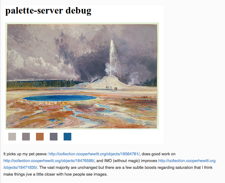
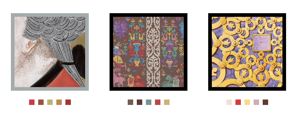
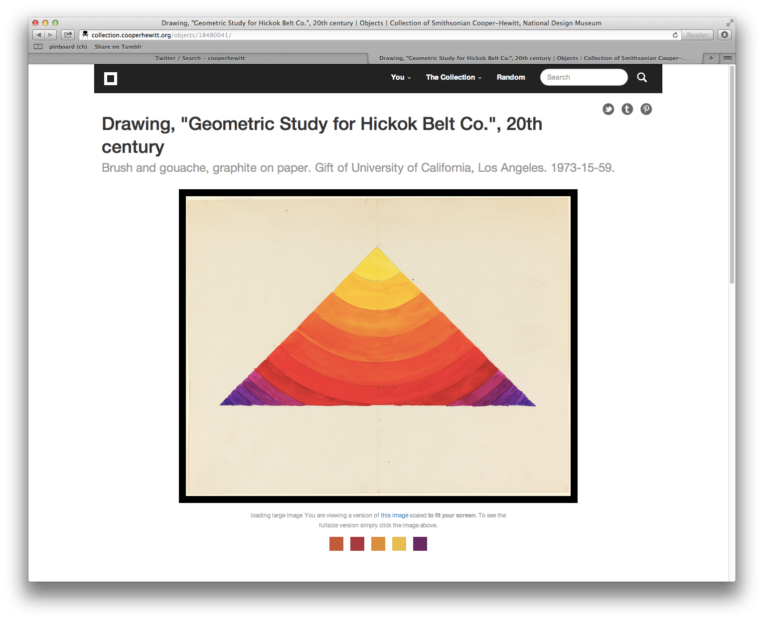
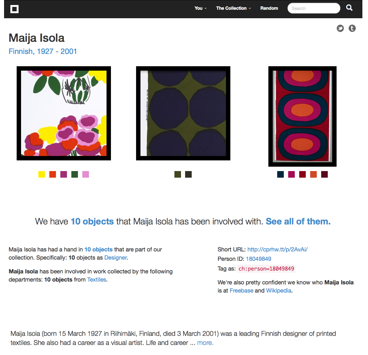
This is the third in a series of three “adventures in universal design,” a design research experiment carried out by Rachel Sakai and Katie Shelly. For an introduction to the project, see our earlier post, here.

SHADOWING:
OBSERVE LINDA & DAVE AS THEY VISIT THE METROPOLITAN MUSEUM OF ART
AUGUST 22 2013

On the Science Sense tour, we met a wonderfully friendly and warm husband and wife duo named Linda & Dave. We asked if they’d be interested in volunteering for some more research by allowing us to shadow them at any museum they chose.

They agreed, and a week later, off we went. Linda is blind and Dave is sighted. They love museums, and they have visited many around the world, together.


Linda & Dave stand in front of the museum, Dave has his arm around Linda. It is a sunny summer day and the entrance is full of people. They are smiling and Dave is wearing a red flowered shirt.

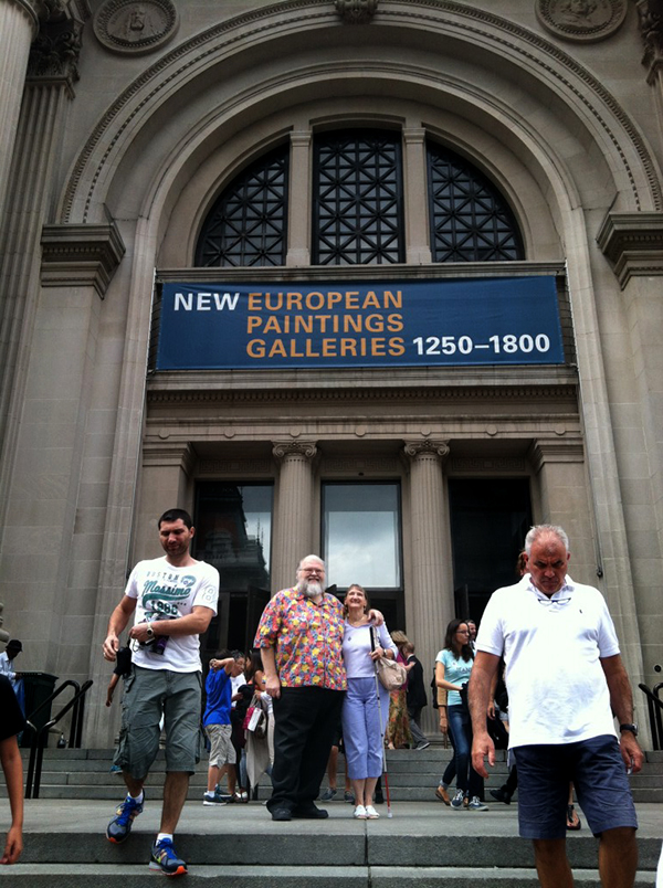
Linda & Dave in front of the Met Museum

Here’s a play-by-play of their visit:

-As we entered the crowded lobby, I noticed that Dave firmly placed his hand near the back of Linda’s neck to guide her—it was so crowded and loud, he had to use firm physical contact to help her navigate the security bag check and chaotic lobby. Linda also used her rolling cane in her left hand.

-Once we got inside, the first thing they did was go to the information desk and ask how to find the exhibition they wanted to see—Brush Writing in the Arts of Japan. The desk person indicated the location on a paper map. L & D didn’t use the map; instead they listened and remembered the attendant’s verbal instructions (left at the arch, elevator to floor 3, make a left, etc).

-Linda carried a paper flyer in her purse with a list of special exhibitions on it, and she brought it out when talking to the attendant, saying “yes, we want to see the one on this list.” Interesting that though she herself could not see what was on the paper, she knew what it said (ostensibly because Dave had told her earlier) and she kept it in her hand, so she could use it later when conversing with others.

-On the way to the elevator, we walked past a table with audioguides, L&D did not notice it.

-At the top of the elevator, we saw an Information Desk with an attendant. Dave expressed excitement that they have Info Desks throughout the Met, saying “before they had these things, I would just wander around this place getting lost!”

-L&D approached the satellite info desk, and asked about the acoustiguide— does it include the Japanese Brush Writing exhibition? The attendant explained that the audioguide covers the whole museum. Audioguides are not being given out from this desk, though. L&D did not get an audioguide.

-We walk down a hall full of artifacts toward the Japanese Brush Writing show. Dave went into “concise tour guide mode” just to give Linda a sense of the scenery, simply naming a few of the objects we went past: “Perfume bottles.” “Ceramic horses.”

-We found our destination: a dimly lit gallery. Linda asked, “is it all paintings?” And Dave explained that no, the gallery had a combination of statues, ceramics, and scrolls. They were pleased that there was a variety of objects and it wasn’t all flat work.

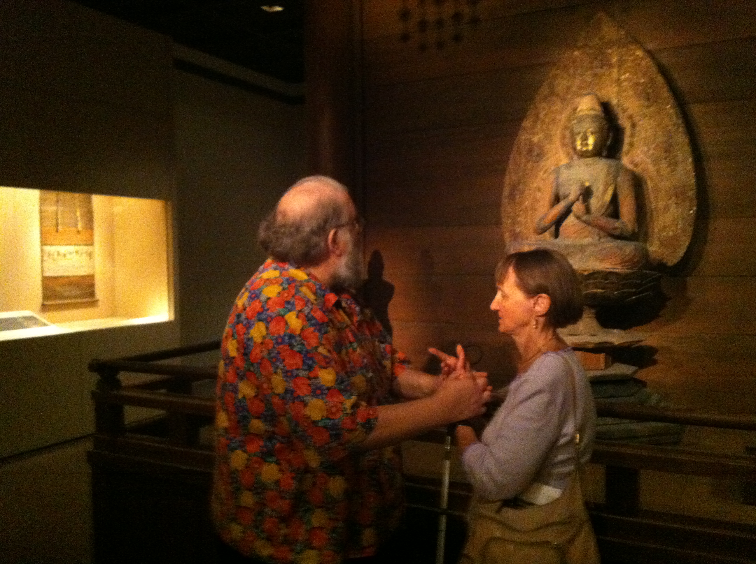
-L&D approached the standing warrior statue at the entrance of the show. Dave began with a visual description of the statue— materials, colors, posture. When talking about the statue’s long earlobes, he lightly tugged Linda’s earlobes. When talking about the statue’s tufty hair, he lightly touched the crown of Linda’s head— anything to make the experience more than just standing and listening. After his thorough description, he read the object label aloud.

-They were very methodical. This is what they did in front of each object they looked at:

1) Dave gave a purely visual description. Colors, size, subject matter, mood.

2) Maybe a few clarifying questions from Linda (“Are the lines roundish or squarish?” “Are the lines harsh?” “Are the people done finely?”)

3) Dave read the object label aloud, sometimes omitting a bit of info, sometimes reading it all right down to the donor details.

4) A bit of back-and-forth, sharing their reactions to the piece, making a connection to prior knowledge or experiences, or simply expressing how pretty and/or interesting they find it.

Dave & Linda standing with their backs to us, facing a beige and black painting.. Dave has Linda's hand in his, and is holding it outstretched.

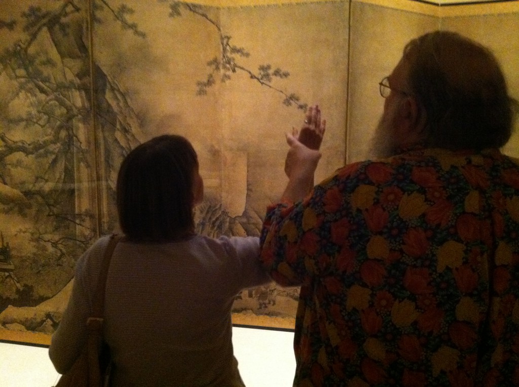
In front of this artwork, Dave guided Linda’s hand through the air to help explain the size and composition. (It looks a bit like she is touching the artwork because of the angle of this photo, but we assure you that she is not).

-Dave often would take Linda’s hand in his, hold it outstretched, and wave it around to delineate shapes and spatial relationships (“there are mountains here, and a waterfall right here…”)

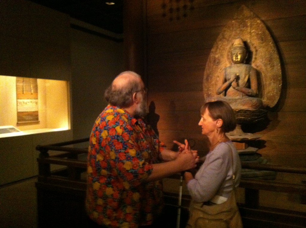
-A few of the Buddha statues were doing mudras with their hands. Dave would put Linda’s arms and hands into the same position, mimicking the statue. Sometimes he’d join her in the pose, so they’d both be frozen, holding the pose for a moment of contemplation. (Extremely adorable.) I don’t think many sighted visitors would think to do this, but it looked like they were having fun, and perhaps gave them a bit of “somatic insight” into how that statue might be feeling.

-As Linda got more details about the piece in front of her, she would exclaim surprise, “oh!” “oo-ooh!” As if she was building an image in her imagination, and each new bit of info from Dave was like an exciting clue in an unsolved mystery.

Dave and Linda are facing each other, standing a few feet in front of a Buddha statue. Dave is looking at the statue, and hoding Linta's arms. Linda is facing Dave and holding the pose.

Dave puts Linda’s arms into the same position as the statue.

-I noticed that sometimes Linda would touch the glass in front of an object. Just to get some sense of space and anchoring, I’d guess.

-About halfway through the exhibition, Dave took a break to sit down on a bench. Linda, Rachel and I took the chance to chat a bit. Linda commented that she would like to get a sense of scale and mood upon entering a museum. A sighted visitor gets a whole bunch of scene-setting information right upon entering with a sweep of the eye, and can choose what piece they want to check out. For her, however, she’s generally subject to Dave’s decisions about what to look at when they tour an exhibition. She said that she doesn’t mind this, because she likes Dave’s taste, but it is a consideration for any blind visitor.

-From Dave’s perspective, it’s a lot of talking and mental work. He seemed to be a bit worn out at times when reading aloud those long object labels. No wonder he needed a break!

-Linda also mentioned that they like to go to the gift shop, and that sometimes there are statuettes or replicas of things in the exhibition that you can touch, so that’s a good blind person’s “hack.”

Linda stands in front of three shelves full of smallish, about one foot tall statues and figurines. She is touching one of the statues.

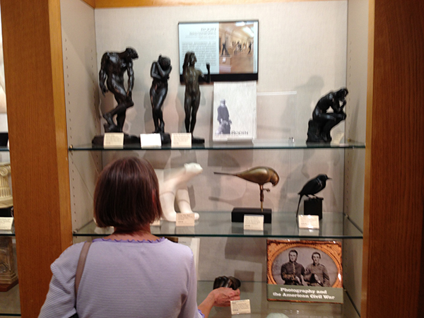
Hacking the museum: the gift shop is a good place to find touchable replicas of objects in the collection.

-As we moved on, we neared a fountain. Right away, Linda heard the water trickling and said, “I hear a fountain!” Dave started to describe the fountain, which, as it turned out, is kinda hard to describe in words. There were some children seated on the wooden platform beside the fountain. Linda asked if she could sit down on the platform, which is somewhat bench-like, but sort of ambiguous-looking as to whether you can sit there or not. We said, sure, go for it. One thing led to another.. and soon Linda was feeling the white stones, and then the fountain itself. There was no guard in the area, just a few fellow patrons who seemed touched and tickled, as were we, watching Linda light up as she discovered the different textures and shapes. “Ooooh!” “Ahhh!” “Wowww!!” She was so, so into it. Just totally beaming. Finally, something to touch! Dave turned to us with a wink, and said “See what a difference tactile makes?”

A darkly colored, slick slab of basalt perfectly centered in a rectangular bed of round white stones. The basalt slab has some smooth planes and some rough planes, and a well of water in the top. Water is running down all sides of the slab.

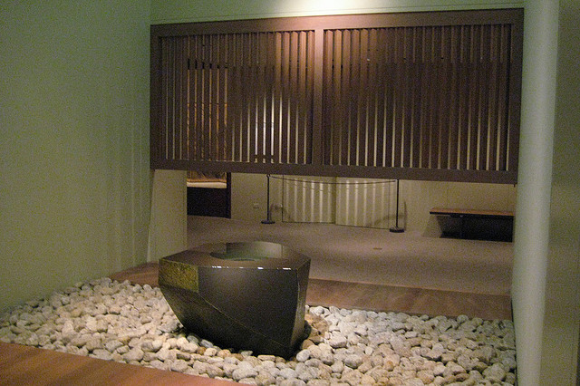
The Water Stone, a basalt fountain by Isamu Noguchi. Photo by Flickr user wallyg

-Our last stop was a Japanese Reading Room, where the museum has tea ceremonies and other social events. The room has some Japanese-style floral arrangements, and beautiful wooden furniture by George Nakashima. Linda gave herself a thorough tour of the furniture, feeling the curves, bends, and joints in the massive walnut table and matching chairs. since it was definitely OK to touch. It was really the only moment when Linda could be independent in the museum.

A room with wood-paneled walls and a large raw-edge, round wooden table in the center. Linda is standing, stooped at the far end of the table, with one hand on the table surface and the other hand on her rolling cane.

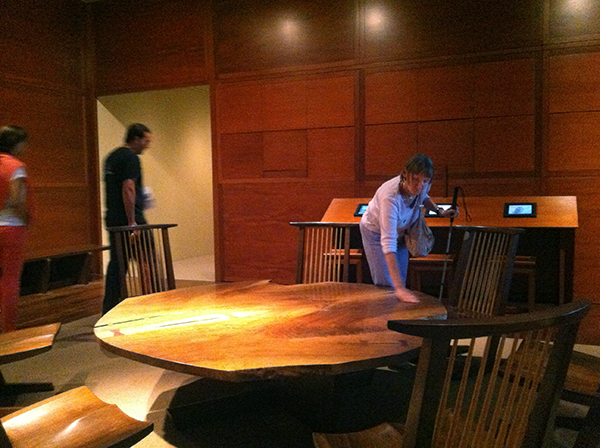
Linda giving herself a tactile tour of the Japanese Reading Room furniture at the Met.

Takeaways

– Linda & Dave had carbon-copy experiences. Many people enjoy visiting a museum with a partner and staying side-by-side the whole time. Sometimes, though, you don’t want to visit in that way. Personally, when I’m in a museum, I tend to break off from the group and explore on my own. How might we allow blind visitors to have the option for an independent experience?

– Sighted visitors can easily get a sweep of the room immediately upon entering. What looks interesting in this gallery? What’s the mood? Where do I want to go first? How might we afford blind visitors a “sweep of the room” upon entering?

– Linda pointed this out to us during the tour: neutral description > coded description. A neutral (and blind-friendly) description would be, “on the left there is a small, simple building with a thatched roof and open balcony on all sides.” A coded (and blind-unfriendly) description would be “on the left there is a small building, looks like early Japanese architecture.” Get the difference? A neutral description uses transparent language that requires a minimum amount of previous knowledge. A coded description requires some prior education or knowledge to understand it.

Tactile makes a huge difference. Tactile moments were highlights of the tour: Dave tapping Linda on the head while describing a warrior’s messy hairdo, Dave sweeping her hand around to convey space, folding her hands into a Buddhist mudra, Linda tapping the glass in front of her for a spatial anchor, detailedly exploring the furniture in the Reading Room and a covert tickling of the Noguchi fountain. I’d argue that if these literal “touchpoints” were formally afforded to all visitors, all visitors’ experiences would be enhanced, not just experiences of the blind and partially sighted.

Quietness of the gallery was on our side. The gallery was small, only had a few people in it, and was carpeted. Dave and Linda could hear each other without straining their voices or their ears. This made the experience very tranquil and pleasant. Imagine how different their visit would have felt in a noisier, more echoy gallery.

We didn’t observe much active use of sound. L&D didn’t have audioguides, and there was no music or anything like that in the galleries. Linda mentioned various fountains in different museums that she liked. As a sighted person, I have to admit that fountains are not usually a highlight for me, but I think for Linda, because it’s something she can experience directly, they are often a highlight. What if museums with fountains (or any acoustically cool architectural feature) encouraged all visitors to close their eyes and really listen?

We didn’t observe any use of tech. L&D kept this visit analog. Wonder how the visit might have been better/worse/the same with some type of technological aid? How to design such technology to support and enhance rather than distract and annoy?

Linda, Rachel and Katie smiling inside a contemporary Asian art gallery at the Met museum. There is a very unusual sculpture in the background of a real deer, taxidermied and covered in glass orbs of variable sizes, as if it had been dunked in an oversized glass of club soda, and all the bubbles were sticking to its sides.

Linda, Rachel and Katie at the Met. We had a good time!