
We often champion processes of iterative prototyping in our exhibitions and educational workshops about design. Practicing what we preach by actually adopting iterative prototyping workflows in-house is something we’ve been working on internally at Cooper Hewitt for the last few years.
In the 3.5 years that I’ve been here, I’ve observed some inspiring progress on this front. Here’s one story of iterative prototyping and inter-departmental collaboration in-house, this time for our new Design Dictionary web video series.
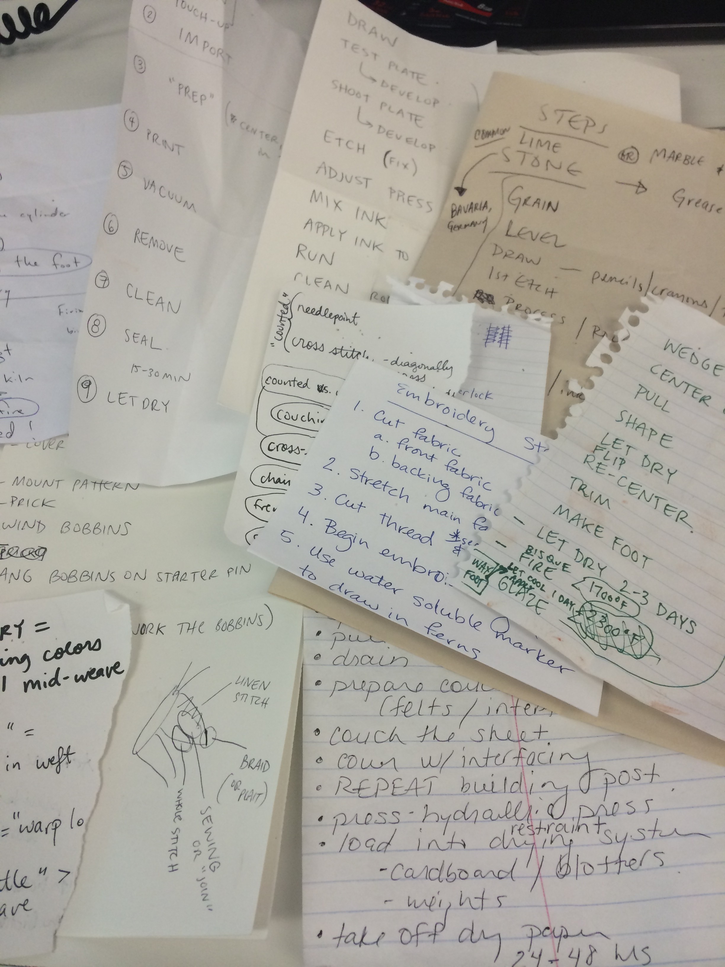
Design Dictionary is a 14-part video series that aims to demystify everything from tapestry weaving to 3D printing in a quick and highly visual way. With this project, we aimed not only to produce a fun and educationally valuable new video series, but also to shake up our internal workflow.
Content production isn’t the first thing you’d think of when discussing iterative prototyping workflows, but it’s just as useful for media production as it is for hardware, software, graphic design, and other more familiar design processes.
The origin of Design Dictionary traces back to a new monthly meeting series that was kicked off about two years ago. The purpose of the meetings was to get Education, Curatorial, and Digital staff in the same room to talk about the content being developed for our new permanent collection exhibition, Making Design. We wanted everything from the wall labels to the digital interactive experiences to really resonate with our various audiences. Though logistically clunkier and more challenging than allowing content development to happen in a small circle, big-ish monthly meetings held the promise of diverse points of view and the potential for unexpected and interesting ideas.
At one of these meetings, when talking about videos to accompany the exhibition, the curators and educators both expressed a desire to illustrate the various design techniques employed in our collection via video. It was noted that video of most any technique is already available online, but since these videos are of varying quality, accuracy, and copyright allowances, and it might be worth it to produce our own series.
I got the ball rolling by creating a list of techniques that will appear more than once in Making Design.
Then I collected a handful of similar videos online, to help center the conversation about project goals. Even the habitual “lurkers” on Basecamp were willing to chime in when it came to criticizing other orgs’ educational videos: “so boring!” “so dry!” they said. This was interesting, because as a media producer it can be hard to 1) get people to actually participate and submit their thoughts and 2) break it to someone that their idea for a new video is extremely boring.
Once we were critiquing *somebody else’s* educational videos, and not our own darling ideas, people seemed more able to see video content from a viewer’s perspective (impatient, wanting excitement) as opposed to a curator/educator’s perspective (fixated on detail, accuracy, thoroughness, less concerned with the viewer’s interests & attention span).
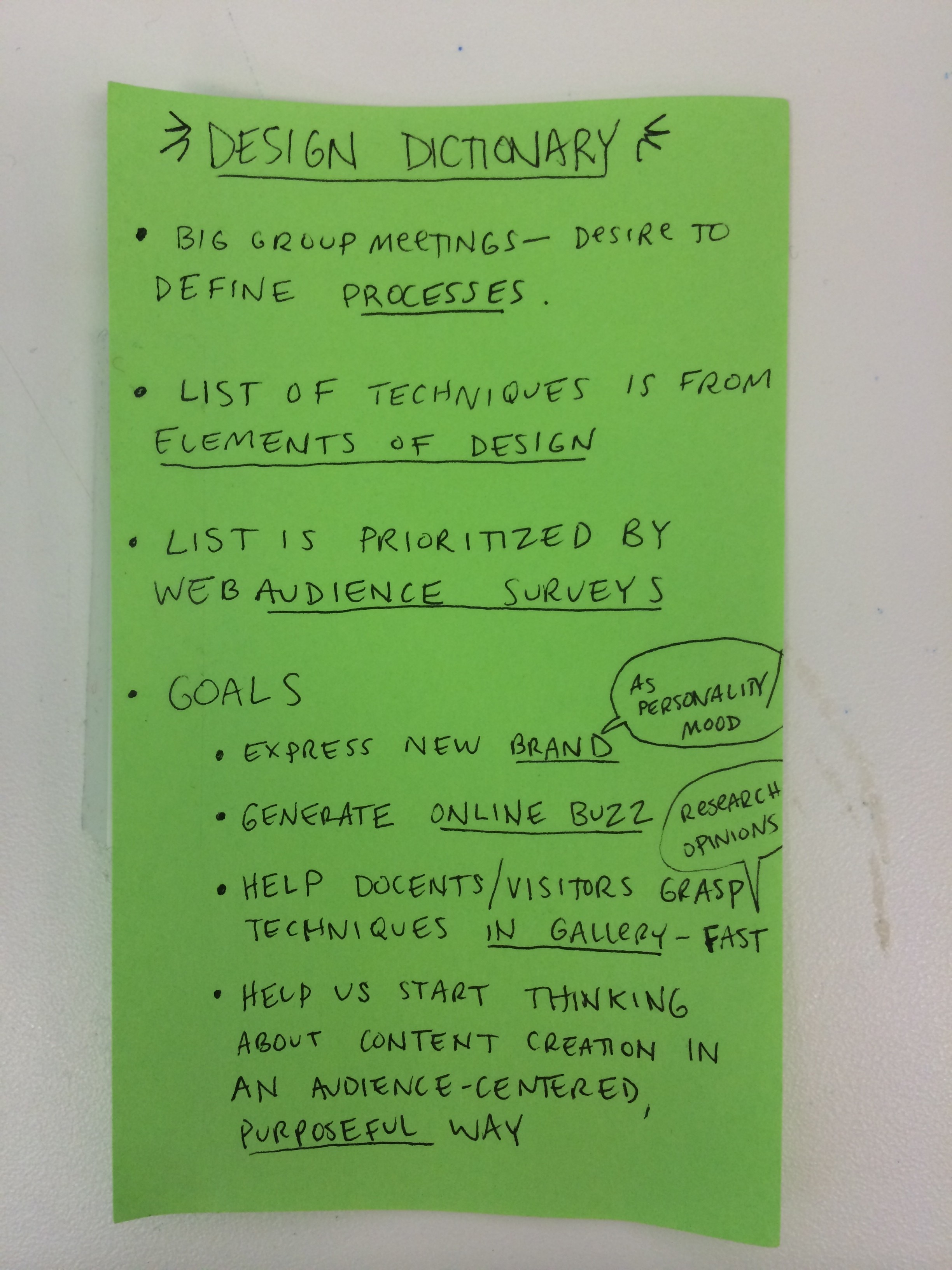
I kept this note taped to my screen as a reminder of the 4 project goals.
It is amazingly easy to get confused and lost mid-project if you don’t keep your goals close. This is why I clung tightly to the sticky note shown above. When everyone involved can agree on goals up-front, the project itself can shape-shift quite nicely and organically, but the goals stay firm. Stakeholders’ concerns can be evaluated against the goals, not against your org. hierarchy or any other such evil criteria.
Even with all the viewer-centric empathy in the world, it can still be hard to predict what your audience will like and dislike. Would a video about tapestry weaving get any views on YouTube? What about 3D printing?
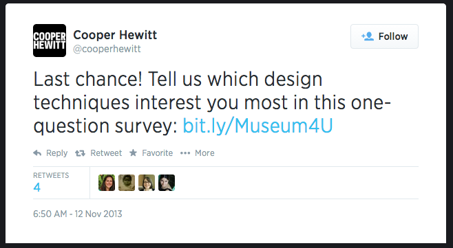
We asked our Twitter followers which techniques interest them most.
We created a quick survey on SurveyMonkey and blasted it out to our followers on Facebook and Twitter to gauge the temperature.
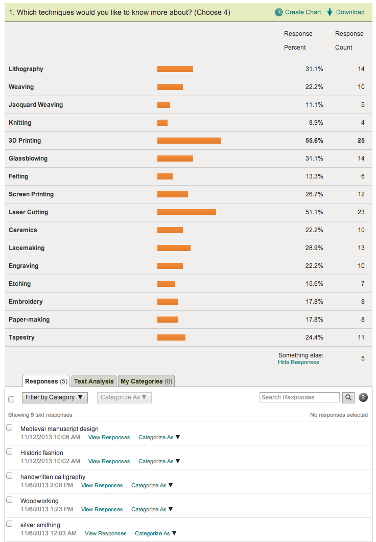
Surveying our Twitter and Facebook fans with SurveyMonkey, to learn which techniques they’d be interested in learning more about.
We also hosted the same survey on Qualaroo, which pops up on our website. My hunch about what people would say was all wrong. We used these survey results to help choose which techniques would get a video.
By this point, it was mid-winter 2014, and our new brand from Pentagram was starting to get locked in. It was a good opportunity to play with the idea of expressing this new brand via video. What should the pacing and rhythm be like? How should animations feel? What kind of music should we use?
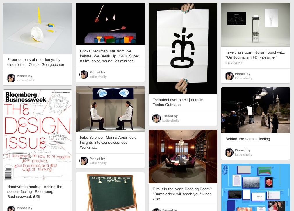
Public mood-boarding with Pinterest.
Seb & I are fans of “Look Around You” and we liked the idea of a somewhat cheeky approach to the dreaded “educational video.” How about an educational video that (lovingly, artfully) mocks the very format of educational videos? I created a Pinterest board to help with the art direction. We couldn’t go too kitsch with the videos, however, because our new brand is pretty slick and that would have clashed.
Then I made a low-stakes, low-cost prototype, recycling footage from a previous project. I sent this out to the curatorial/education team for feedback using Basecamp.
In retrospect I can now see that this video is awful. But at the time, it seemed pretty good to me. This is why we prototype, people!
With feedback from colleagues via Basecamp (less book, more live action, more prominent type), I made the next prototype:
I got mixed reactions about the new typography. Some found it distracting. And I was still getting a lot of mixed reactions to the book. So here was my third pass:
I was starting to reach out to artists and designers to lend their time to the shoots, and was cycling that fresh footage into the project, and cycling the new video drafts back to the group for feedback. Partially because we were on a deadline and partially because it works well in iterative projects, we didn’t wait for closure on step 1 before moving on to step 2.
I got a crash course in 14 different techniques.
Every new shoot presented a new chance to test the look and feel and get reactions from my colleagues. Here was a video where I tried my own hand at graphical “annotations” (dovetail, interlock, slit):
By this point my prototype was refined enough to share with Pentagram, who were actively working on our digital collateral. I asked them to style a typographic solution for the series, which could serve as the basis for other museum videos as well. Whenever you can provide a designer with real content, do it, because it’s so much better than using dummy content. Dummy content is soft and easy, allowing itself to be styled in a way that looks good, but meets no real requirements when put through a real stress test (long words, bulky text, realistic quantities of donor credits, real stakeholders wanting their interests represented prominently).
Here is a revised video that takes Pentagram’s new, crisp typography into account:
This got very good feedback from education and curatorial. And I liked it too. Yay.
All-in-all, it took about 8 rounds of revision to get from the first cruddy prototype to the final polished result.
And here are the final versions.